Recess
Taking school spirit to another level
School spiritwear sites seemed to be severely lacking. There was a significant gap in quality, customer service, and overall variety. So, Recess stepped in with a new approach where custom design, premium quality, and convenience became pillars of the business.
To reflect this, we created an identity that was friendly and chill, but that reveled in all the designy details. To reinforce the company’s commitment to quality, we helped participating schools reimagine their brands. All this while giving back 10% of the profit to the schools. Now that’s a heck of a playground!
CATEGORY: E-commerce, Identity Design, Merchandise
CLIENT: Recess Spiritwear
AGENCY: Katie O’Malley Design
ROLE: Creative Director, Lead Designer
CREDITS: Katie O’Malley
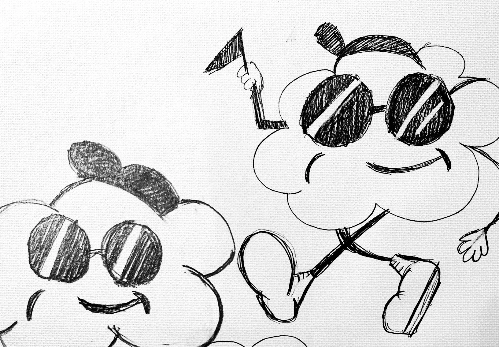
The logo for Recess needed to represent school pride in a universal way. While we explored all sorts of recess equipment and options, the concept of being outside in the fresh air and sunshine resonated the most. So what is more appropriate than a mascot made from a cloud. The color palette was kept pretty neutral in light blue and a bright blue with lots of white space.
Typography was treated in a bubbly playful way to mimic the cloud character and the relaxed fun nature of the brand.
Identity pieces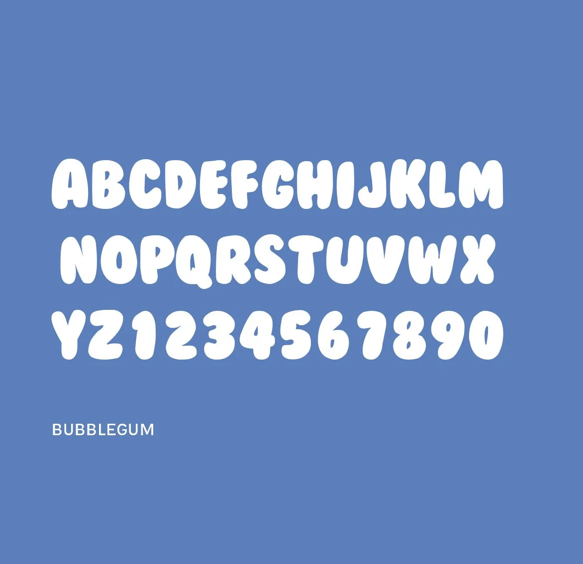


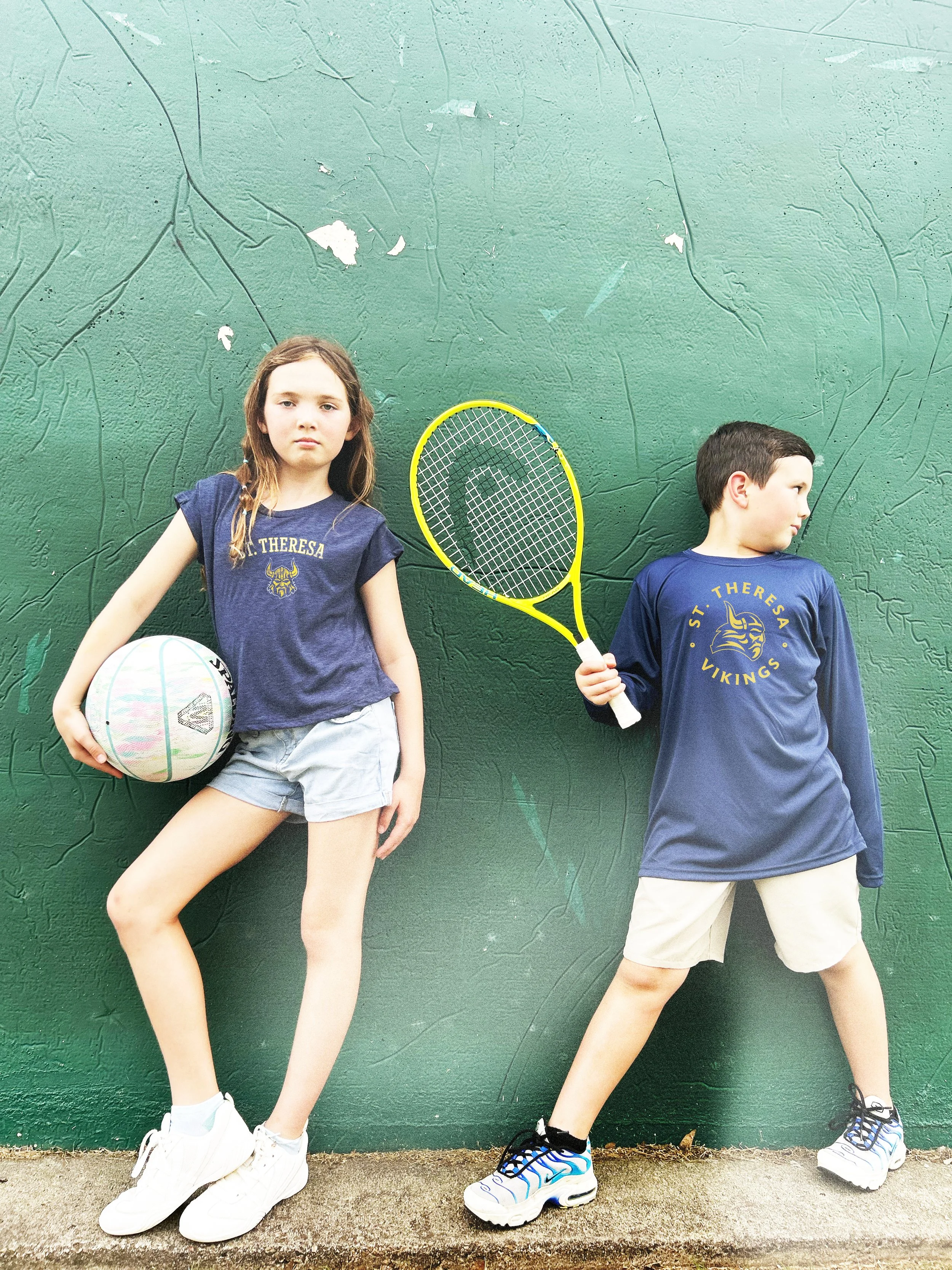
PhotographyThe backdrop for the photoshoot was a playground and lots of sky.
The intention was to have the shots feel carefree and unrestricted playing to the idea of recess.
Clothing was kept neutral so that school branding could be applied later for the merchandise on the website.


Iconography


Holographic stickers designed to adhere to bags and poly mailers that the school merchandise was packaged in for delivery and pick up.

Additional logo treatments and wordmarks created to have a flexible identity system that can be used on items that promote the brand. Lockups included the cloud character, the flag and the typography.


School merchandise for st. theresa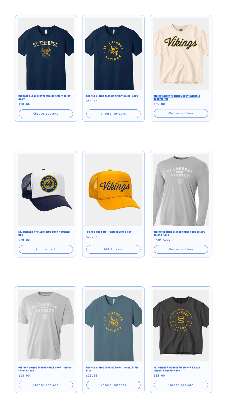
Redesigning the school brands
In the process of creating the Recess site, we set out to not only provide great quality merch, but also great-looking merch. Some of the schools that we worked with had brands that were long overdue for a refresh, so in order to get them the best gear possible, we gave them makeovers while we were at it.
St. Theresa
St. theresa Before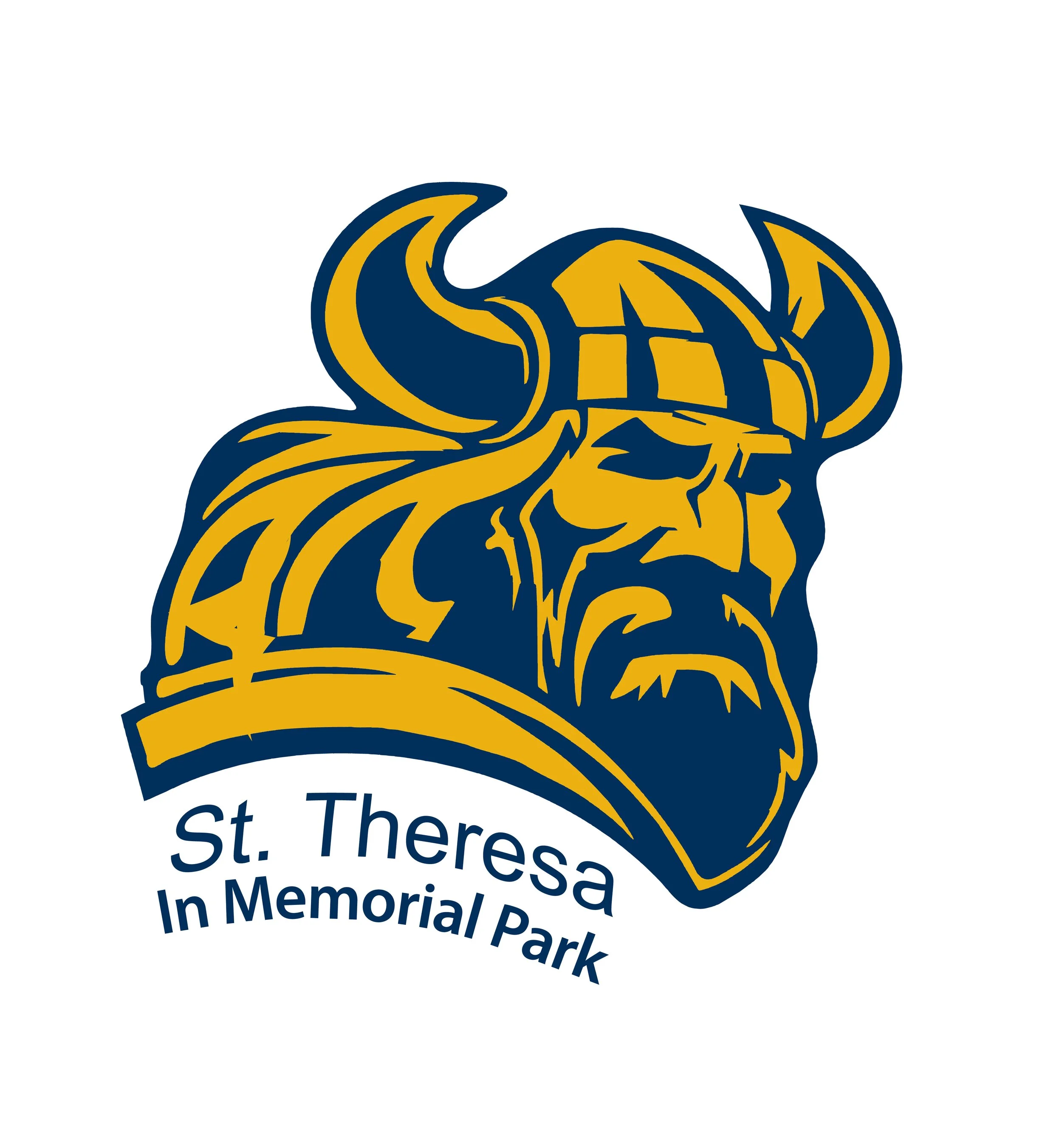

Revised side viewTaking the previous 3/4 looking viking we reimagined it as a profile with some movement in his hair to create a more dynamic option.
Revised front view
The forward-facing option is an alternative to the profile, but depicts the same viking at a different angle. Using the same helmet, horns and facial hair, the character becomes a language for the school.
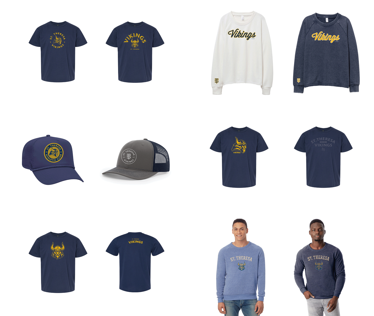
Additional monograms, typography and colors were added for variety on the merch

Melinda Webb School
In the same way we redesigned St. Theresa, The Melinda Webb School, part of the Texas Hearing Institute also needed a refresh for their spiritwear. The lion character they were using had been illustrated quickly and did not fully represent what their school was known for as the hearing aids were very small in the full scale view of the lion.
Melinda Webb School before
Revised Lion
The revision to the listening lion logo included focusing in on the face so that the hearing aids were more visible. Creating sound waves to also draw the eye to the ears and revamping the overall look of the character.
Additional monograms, typography and colors were added for variety on the merch


